We began with the full spreads where we worked out margin & gutter ratios and dimensions which would frame the work in a structured format at the same time as letting the work jump out in the most effective way possible too.
We struggled to tackle the pagination because of the project reference codes that would take up the sides of the images, however when considering the half-page insert within the spread, we realised we could show the page number beside it on the bottom of the page with a consistent margin to the outer-edges of the pages.
We also had the idea to contain the student's name on the top of the right side of the spread which would be hidden by the half page insert when the student's name is visible there. This means the name of the designer is always on show.

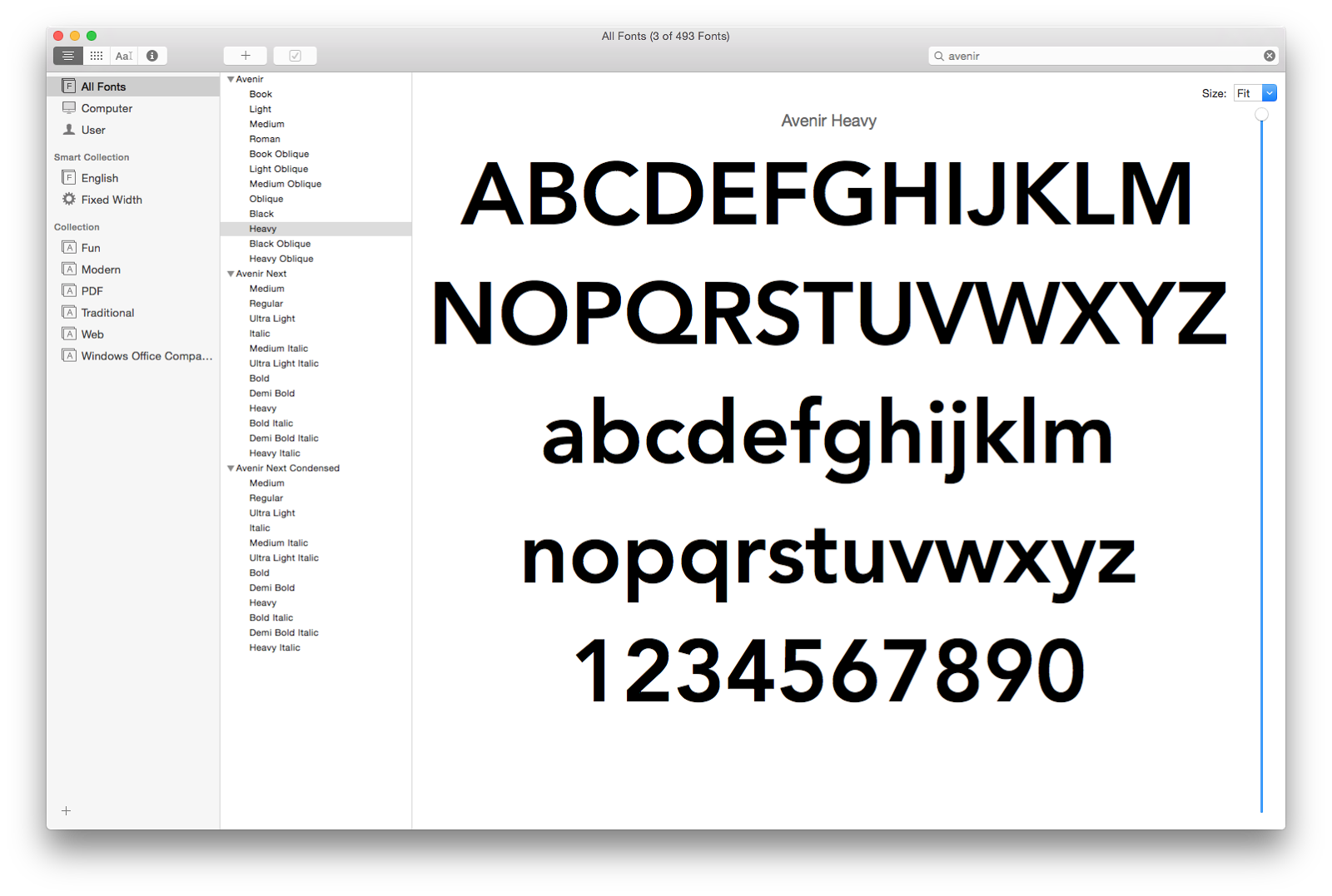
In respect to the half-page insert, we chose to use Avenir Black & Heavy because it was as close as we could get to what we actually wanted without costing a fortune in licensing fees.

We were originally going to have much bigger type (19pt) but because of the word limit we issued in the e-mail, we found that we had to pull this down to 12pt or some student's bios would not fit.
This wasn't as aesthetically pleasing but much more functional and didn't sacrifice too much appeal in the process.


Now we had a functional design we were all happy with in both format and aesthetics, we divided the yearbook entries between us to art-work and got things started.
Leave your comment