After considering printed merchandise, prize money, sponsorships, print, web hosting, etc, the last part of the budget went to an incredible action photographer who focuses on cycling. Szymon specialises in dirt bikes and fixed gears and I have worked with him previously on another project in my second year.
There was no more money left to hire a videographer so I jumped to the opportunity to try something completely different to what I have done before professionally. I know my way around adobe premiere and I am very knowledgable on how a high end DSLR works, therefore I said when I wasn't competing or networking, I would film the event and then create a promotional video for Halleycat III.
Before jumping at it, I decided to watch a few fixed gear orientated videos to understand distances, pans, motion and the best way of capturing it all at once.
Extended Practice
Alex Dyson
Archives

OUGD603 — Brief 02 - Bijou Bridal Boutique - Location Photography
The client & website needed some professional photographs of the boutique so potential customers know what to expect from the boutique when looking online.
I kitted myself out with my Canon EOS 60D, tripod, flashgun, 50mm lens, 18-55mm lens and a 10-22mm lens i loaned from the photography department.
The 50mm is perfect for close ups and detail shots, and the 10-22mm was an excellent wide-angle to get in a lot of the boutique in each frame.
All of the wide angle shots were taken on the tripod and as a long exposure to allow consistency across the photographs and to make the spotlights flare and make a twinkling effect.


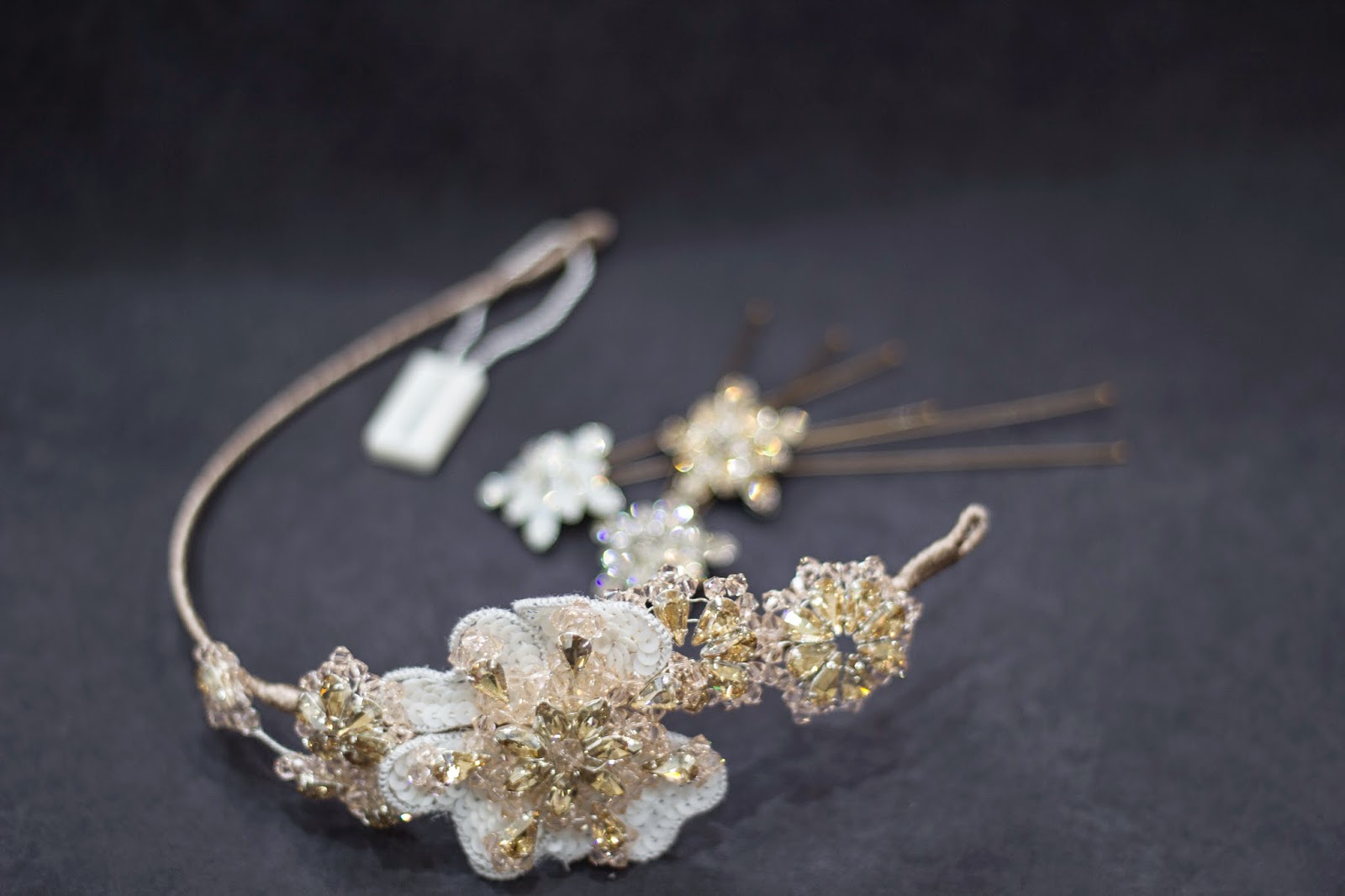


Whilst I was there I also took photos of the stationary I had designed for the boutique in context and on a silk satin cloth for my own records and portfolio.


OUGD603 — Brief 03 - Dr.Me - Brief 003
For my freedom brief, I created a visual map of my interests. It was basically just a reason to play with colour overlay options.

OUGD603 — Brief 03 - Dr.Me - Brief 002
Our second brief was to create a poster for a Canadian band's show. I started this by drawing the type in a messy and rushed way to link to the band's interesting hand-rendered visuals over all their media.

This was then vectorised and placed into indesign in an A3 document with a modular grid set up. The rest of the information was Helvetica Neue Bold to contrast the hand rendered band name. I laid this out in a logical order of hierarchy for a piece of content that is easily read and understood.


The colours were pushed throughout the design to keep consistency.

At the time of finishing the brief, Dan hadn't yet designed a poster so we pushed this as our final submission for brief 002.
This was then vectorised and placed into indesign in an A3 document with a modular grid set up. The rest of the information was Helvetica Neue Bold to contrast the hand rendered band name. I laid this out in a logical order of hierarchy for a piece of content that is easily read and understood.
The background image was taken from the band's website of the frontman in some strange mirror room. I distorted and manipulated this image until it was simple, effective and eye-catching.
The colours were pushed throughout the design to keep consistency.
At the time of finishing the brief, Dan hadn't yet designed a poster so we pushed this as our final submission for brief 002.
OUGD603 — Brief 03 - Dr.Me - Brief 001
Vinyl Cover Design.
Me and Dan decided that Dr.Me's collage style was very interesting and neither of us had done anything like it so we wanted to give it a go while they were there to give us feedback and advice.
We listened to the mix and listed words that came to mind when we were letting it sink in. We also highlighted the words which we saw as more important. These words were:
Foggy city, misty, thought provoking, eerie, dreamy, sky, silent hill, dug 3, radio transmissions, tapping, fluctuations, Russian, mind control, euphoric, industrial & repetition.
We then used those words to expand into more visually stimulating words that bounced off the original words. The better ones were again highlighted.
Misty — Soft, blurry, opaque.
Euphoric — Weightless, careless.
Eerie — Mysterious, unknown.
Industrial — Smog, structure, factory chimneys.
Repetition — Tapping, loop, transmission.
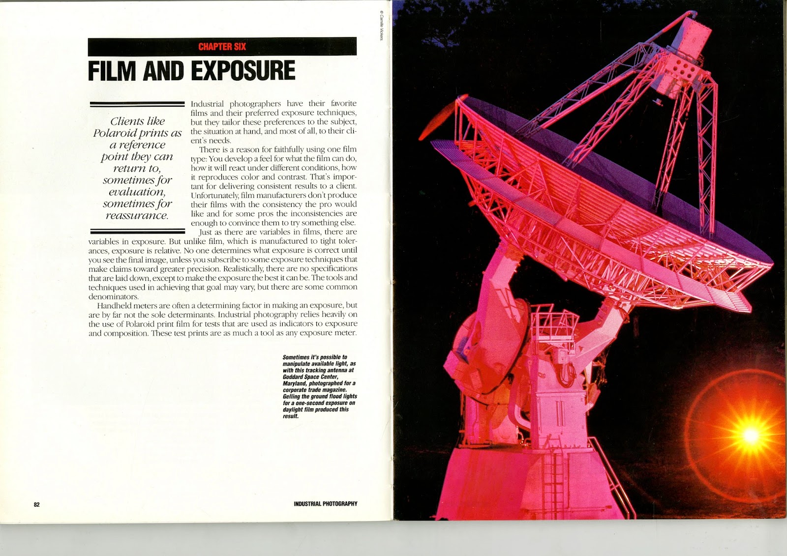
After our initial thought processes, we went to the library to scout out some books to scan in for interesting imagery that visually communicated our idea journey.


From here, we came up with a few ideas with the sources we had and got to work independently. Using a combination of background and type layout, I created a trippy composition for the artwork which consisted layered opacities of a scanned image as well as fading techniques to draw attention to the name and artist.


Me and Dan decided that Dr.Me's collage style was very interesting and neither of us had done anything like it so we wanted to give it a go while they were there to give us feedback and advice.
We listened to the mix and listed words that came to mind when we were letting it sink in. We also highlighted the words which we saw as more important. These words were:
Foggy city, misty, thought provoking, eerie, dreamy, sky, silent hill, dug 3, radio transmissions, tapping, fluctuations, Russian, mind control, euphoric, industrial & repetition.
We then used those words to expand into more visually stimulating words that bounced off the original words. The better ones were again highlighted.
Misty — Soft, blurry, opaque.
Euphoric — Weightless, careless.
Eerie — Mysterious, unknown.
Industrial — Smog, structure, factory chimneys.
Repetition — Tapping, loop, transmission.
After our initial thought processes, we went to the library to scout out some books to scan in for interesting imagery that visually communicated our idea journey.
From here, we came up with a few ideas with the sources we had and got to work independently. Using a combination of background and type layout, I created a trippy composition for the artwork which consisted layered opacities of a scanned image as well as fading techniques to draw attention to the name and artist.
Dan created a scene in the clouds with the satellite dish we scanned in, he then printed it and scanned it back in to give it a hand-rendered texture and flatten it slightly too.
We both preferred Dan's version so as studio "DEAD" we decided to go with that one.
Subscribe to:
Posts (Atom)
Copyright 2010. All rights reserved.