Archives

OUGD603 — Brief 11 — Woodrups & Restrap TCR Film - Brief

A good friend of mine Tim is taking part in the Transcontinental Race this year and required a reliable, well built, travel friendly touring race bike that would carry all of his supplies from Flanders, Belgium to Istanbul, Turkey.
This was the perfect opportunity for Woodrups, the steel frame builders to collaborate with Restrap, who are currently working on a large-scale touring range using magnetic buckles (saddle bags, frame bags, panniers, etc) and make Tim a completely hand-made bike solution to take him from A to B. I was commissioned to document this process with film and photography to create a final product that promotes the craft of this bicycle that will be featured at the Bespoked 2015 Bicycle Show this year.


OUGD603 — Brief 09 — Yearbook - Talk with Jason form Evolution Print

I took some very brief notes to refer back to when we had our meeting with Amber and Danny which is yet to be scheduled.

Jason said that last year, everyone produced perfect bound books.

Mixing stocks is doable as long as pagination in worked out.

450gsm is maximum thickness.

There is papers that are coated / uncoated each side.

 80gsm half page inserts are doable.

Quarter bind is doable.

For perfect bound jobs, they require the indesign document in single pages to determine the spine size.

ASAP — Max deadline 22nd of May?

OUGD603 — Brief 07 - Restrap Packaging — 04 - Shoot Illustrations

My next task was to illustrate the diagrams to show the shoot strap in context. I took photos of the different elements to use as reference as well as use the images from the kickstarter for strap positions.


I started with the front diagram to encourage consumers to try opening and closing the magnetic buckle on the strap.


For the instructional diagrams on the back to explain how to loop the snaps, I wanted to give it a bit of 3D perspective. This was quite difficult in comparison to the flat based illustration but I feel like I got it pretty spot on as a step by step.


I needed to show the two different wearable positions. In our meeting we discussed this should be extremely simple, minimal detail in the camera and the body with a focus on the strap positions. For this reason I left the body completely blank.


For the Shoot Mini packaging I needed an illustration of it on someone's wrist to show it in context. I kept this extremely minimal and stylised in the same way the wearable positions were illustrated.


OUGD603 — Brief 07 - Restrap Packaging — 03 - Shoot Snaps Packaging

I thought I'd start with the smallest job which required no illustrations.

When I went to meet with Nathan, we sat trying to work out a cost effective way of doing the packaging for this without ordering from their usual 2000 min printers.

I had the idea to use a cheap business card printers to get 100 85mm x 55mm cards printed that had all the branding on it with holes that nathan could punch out himself with a hole puncher. Nathan agreed this would be an easy way to do it low quantity.


I sent it over to Nathan to be cleared but he mentioned having some illustrations on the back to instruct how to attach the snaps to the camera loop. This was a fair suggestion as I thought the audience would be people just buying extras from what they already had, but maybe if someone buys it second-hand and wanted extra snaps for other cameras, they wouldn't know what to do with them.

These illustrations were completed during the process of the Shoot packaging for the back of the box but fit nicely on the back of the card beside the bar-code once i had the update from Nathan.


OUGD603 — Brief 10 — Process - Brief

I got an email from Mike Williams who graduated last year inviting me to take part in an exhibition called 'Process' which celebrated the brewing process of craft beer with artwork by designers, illustrators, artists who have worked with breweries. This was the brief that he sent.


OUGD603 — Brief 09 — Yearbook - Presentation 2.0

As always I was a bundle of nerves to be presenting in front of the whole course our concept ideas for our year-book this year.

People already had a bad-expectation because of what they got from our previous presentation and what others had said without fully understanding what we were doing.

It was our job today to make sure everyone was completely clear on our idea and how it would work as a yearbook as well as outside of one too. Explaining concisely that our archiving system would not identify them as a number or code but only aid the discovery of their work via the systematic contents page in the form of specialism reference codes.


The overall reactions were as expected but not as bad as we thought they'd be. We wanted to keep the questions period conversational between the course so they were absolutely aware that we were deciding all elements as a course and everyone's thoughts and ideas would be considered towards improving the finished book.

By the end, everyone 100% understood the concept and the direction as well as what it consisted of. In reflection to the presentation I feel that with the more effort of preparation I did before - helped with my nerves and keeping on topic with what I was discussing/explaining. We all did a great job explaining the concept clearly and we sold the idea to the course well.

We have organised to discuss different elements of the yearbook on Friday at 13:00 so people can put forward their ideas, concerns and help develop the yearbook into a finished outcome we are all proud to be in.

OUGD603 — Brief 09 — Yearbook - Biography + Spreads

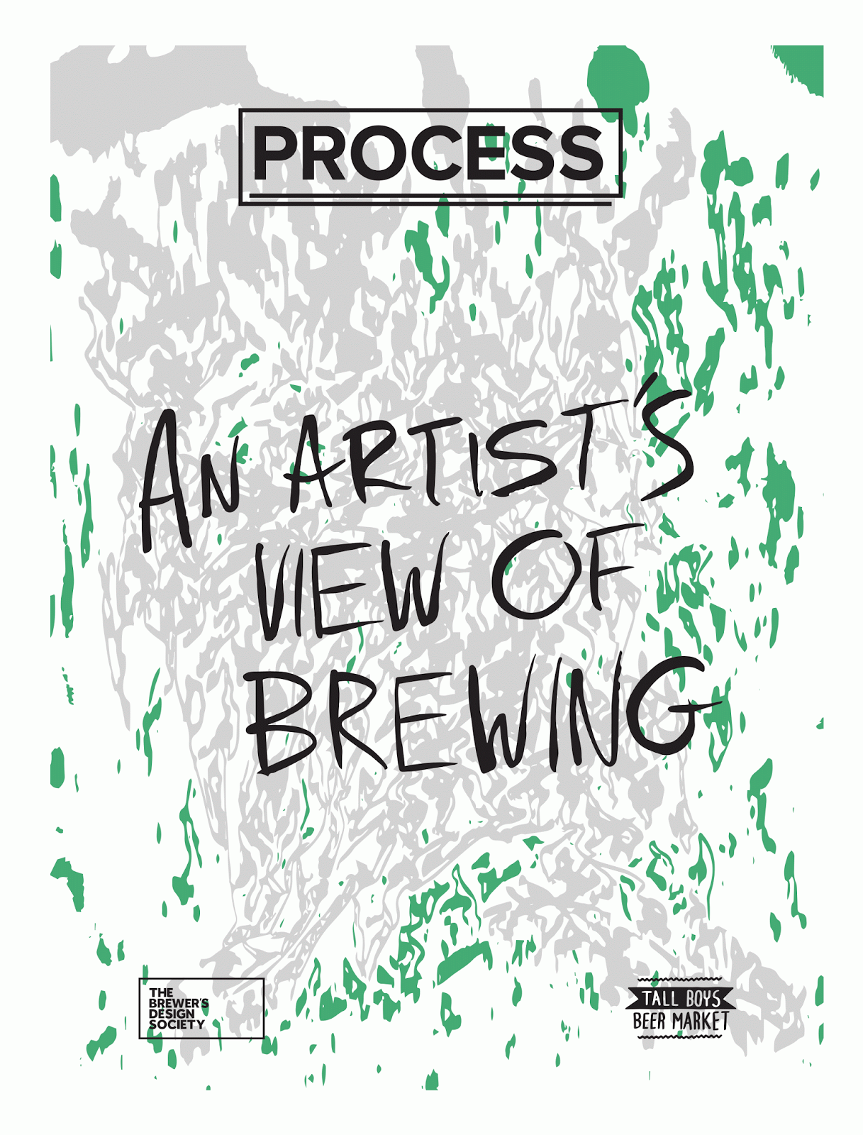
As part of the presentation we needed to show some examples of page spreads as well as the half-page insert between it.

Because I have photographed my work, I was chosen to be the example.

Me, Harrison and Jasper went to the library to seek some examples of layouts for images only and we really loved this example of hairline margins to use up the spread-space effectively.


I picked out some completely different pieces of work so we could see it at it's least organised or consistent and gave it a go with a few different variations of layout but after seeing it we felt like it needed more framing to tidy it up.


We looked at some more books and thought that a combination between a higher spaced gutter (example 1) and more intimate margins (example 2) would hold the page a lot better.


Using a set of 12mm outer / 18mm inner margins / 7mm gutters I created another grid system that would aid in framing the individual photographs and allow breathability between them.


This worked a lot better and the rest of the group agreed that it presented the photographs more dynamically without feeling overcrowded.

The next part was to design the insert for between the spread to hold the information on.

I worked out my bio info and then began designing possibilities using the dimensions of the insert which would be half the normal pages (8.5 x 17 cm).

Bio:

I am a graphic designer with a strong passion for the concepts and construction of independent brands, fused with an interest in the impact that can be delivered by type & image in the form of both physical products & screen based media.

Interests:

Bikes, Beers, and Burgers.

Experience:

Intern at Analogue Creative.

Selected Clients — Kinoko, Tokyo Fixed, & Restrap.

Achievements:

Dialogue Exhibition (Leeds 2014)

Contact:

hello@a-dyson.co

+44 (0) 7788 587 307

www.a-dyson.co

Me and Jasper went into the corridor and quickly took my photo to use and I quickly edited it to black and white half-tones.


Our final decision was on the option below. We felt that the space was well distributed and it had a cleaner and well constructed appearance that linked to our creative practice and professionalism as a course.


Copyright 2010. All rights reserved.