Archives

OUGD603 — Brief 08 - Tokyo Fixed Jersey Kit - Colour

The colour started off with pinks and blues as first described in an e-mail Josh, (brand director at Tokyo Fixed) had sent to me.

As the patterns developed however, the colour began to change too. Nothing was really fixed while developing the patterns themselves as the colour could be altered at any given time.


The background turned to a light sand colour to give a more natural feel to the pattern.


When I began playing with line-based halftones, I oversimplified the colour-scheme which was mentioned in the feedback received from Josh, from there I said I would go a bit crazy with colour and send them a load of variations to choose from so every direction has been scoped.


In the feedback gained from the selection I sent over, he said he loved the pink and green ones but felt they should be a bit paler and more natural than vibrant and for all the soil to remain the same colour.


This was finalised and sent as an illustrator file to Josh so he was able to mock it up in a jersey template and discuss it with Max.

OUGD603 — Brief 08 - Tokyo Fixed Jersey Kit - Patterns


Now that the illustrations were completed, the next step was to develop a strong pattern that could work in print on cycling jerseys (example above).

I created a series of variations with amazing constructive feedback flowing back and forth until coming to a final decision.


After the first four variations were sent, I received feedback to attempt constructing a weaving branch that flowed throughout the pattern. I felt that even though it worked, it felt too bust still.


This was noted in the emails between us and I tried an extreme of simplicity by removing all but one colour and creating an image from line-based halftones.


They loved the halftone texture but felt that the trees needed to be bigger and contain different colours for the branches and leaves still. This was amended and they were really happy with it and considered it finished.


Colour was also decided amongst these examples, however for the purpose of documentation I have created a separate post for this.

OUGD603 — Brief 09 — Yearbook - List of Specialisms

Before coming back together to develop our pitch presentation and make it more clear, we split some jobs up to have done. I had to review the specialism reference codes.

Branding — BRND
Packaging — PCKG
Advertising — ADVRT
User Experience — UX
Print-making — PRNTMK
Web-design — HTTP
Motion-graphics — MTN
Typography — TYP
Illustration — ILLUS
Art-direction — DRCT
Photography — PHOT
Copywriting — CPY
Videography — AV
Editorial — EDIT
Concept-focused — CNCPT
Information-design  — INF
Product-design — PRD
Interior-design — INTR
Pattern-design — PTRN
Installation — INSTL
Signage — SGN
Exhibition-design — EXBT
Crafting — CRFT
3D-graphics — 3D

I was still unsure whether 'Concept-focused' should be included as we all are on our course as the ideas don't happen without a concept.

OUGD603 — Brief 06 — Capital North - Train Graphics

With the logo completed, my next task was to illustrate trans that would run along the route. I felt that rather than having one train that presented all four cities, it would be a more interesting outcome to have four varieties of train that ran the same transport route, but advertised each city independently, but at the same time, possess the same branding.


Everyone really liked the trains, we also had the idea to animate them with after-effects, so I gave the files to Abi as I haven't got the software or know how to use it.

OUGD603 — Brief 06 — Capital North - Logo

We all had a go at developing the logo to reflect our concepts, and later, I was chosen to develop it further.

We all liked and felt like the original logo I designed was a strong look that represented the combination of cities and the upward rising of them all in unison. It felt corporate but not boring, and it made an impact.

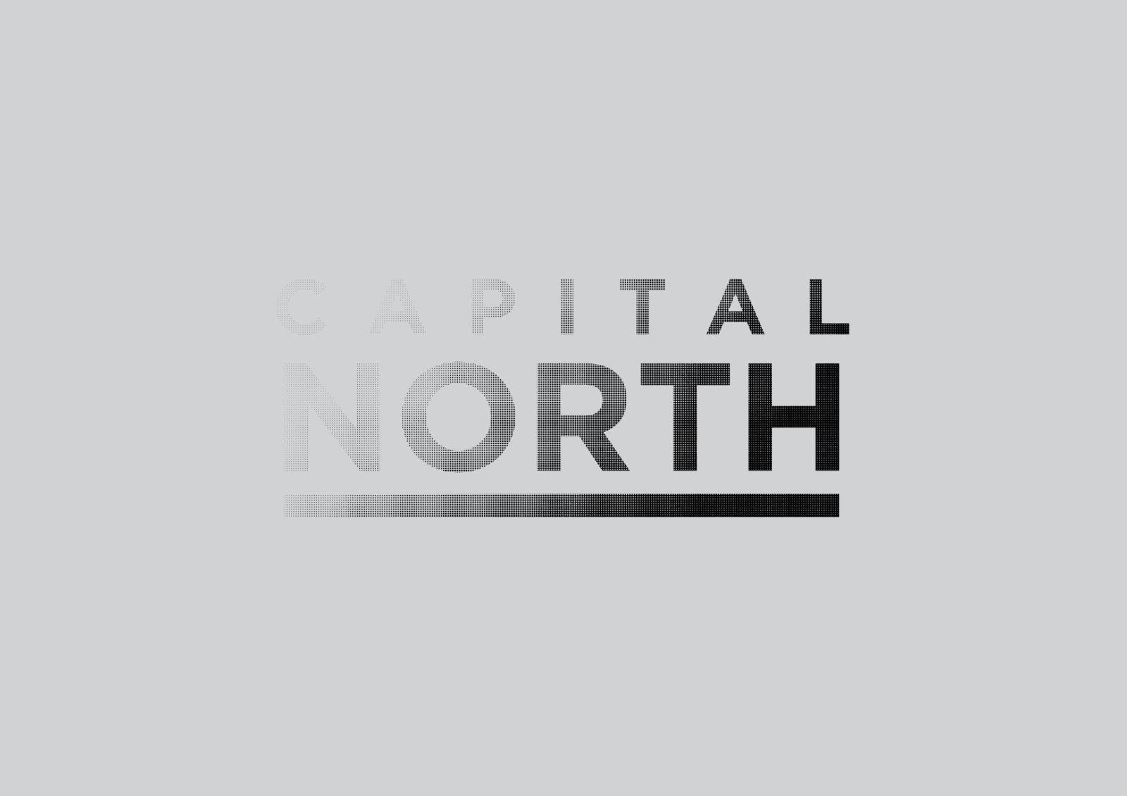
I later had an idea to push this further towards the 'escapism' concept. Using a combination of an upwards mono fade and halftones, the logo itself would 'escape' upwards to symbolise the people's possibilities up here.


After a few goes, I managed to find a good balance of fade that didn't leave the logo illegible at any size.


Once this had been achieved, the idea was pushed to make that escapism concept even stronger by allowing the halftones to escape away from the logo's frame.


Upon receiving feedback, everyone was very happy with the final outcome and it was ready to be implemented among further works to show context and brand.

OUGD603 — Brief 06 — Capital North - Concept

When we first started the project, we made the mistake of jumping straight into trying to figure out what it'd look like. I'm not quite sure why as I have never done that before but as expected, it didn't work (and also never looked good).

When DBA came to see how we were getting on, we went on to explain how 'the north is up, and the top is always the best, etc'. It sounded so bad when we explained it and they thought the same. We were given some mentoring in regards to how to execute the planning and figure out what needed to be done.


This method helped us close in on what actually mattered about the brief and where we needed to place our concentration.

In regards to audience, even though the brief said everyone. It clearly isn't. So who are they?

What is better/worse about the competition (London). And what is/will be better about the north to make people want to come up here to invest into businesses, try a different quality of life, etc?

Abi spoke to Simon in our tutorials and they discussed this brief and Simon said it would be silly to try and compete with London because at the end of the day, if people want to go to London, they will. 

With this in mind, we got together as a group and discussed it, it was clear that it would be silly to attempt that, so why not just try to capture the people that do not like London/are unhappy with their lives in London or just aren't interested in the stress, busy surroundings, ignorance and expenses that come attached to our capital?

This felt like our calling so we began our concept based on that, the escapism of everything bad about London but with all the benefits of it.

OUGD603 — Brief 08 - Tokyo Fixed Jersey Kit - Illustrations

I started my illustrations by gathering a selection of references to understand different branch constructions and leaf patterns. 


From these I sketched a selection of four trees in fine-liner.


Once the sketches were complete I got to work on vectoring the trees into a more detailed, stylised format to allow for quality printing and simplicity in design.


Even though it took a lot longer than I had originally hoped for, I was very happy with the outcomes of each of the illustrations, they all looked different but at the same time part of a set. This was something that would be an important element upon developing the pattern.

I sent the first one to Kinoko just to make sure that I was fulfilling the look they were envisioning and fortunately I had understood what they were wanting.

OUGD603 — Brief 09 — Yearbook - Positive Results

It came to Tuesday and we were given a small amount of feedback and it was revealed that our team had won the pitch. (Woohoo).

This felt great and reinstated some confidence in our presentation. Unfortunately it was overheard that some people were unhappy with the tutors' decision and were going to make an effort to express that. This was really disappointing to hear and made me feel like some of the people around us were acting quite immature over the situation. 

Rather than dwelling on it, we got together the following day to receive a more focused amount of feedback from Danny and then made ourselves a short action plan.

We had another presentation to give to further explain our concept and any developments since. Our first priority was to make our concept clear to those who either didn't like it or couldn't understand it.

Other than that we decided we should make a physical mock-up of what we were aiming for, develop the concept further afield from the book and into way-finding, merchandise, and environmental design.

OUGD603 — Brief 09 — Yearbook - Presentation


Even though we put a lot of work into the development of this concept and the presentation prep itself, we didn't feel like we communicated it well enough and expected people to be a bit puzzled by it. Hopefully the tutors understood the extent of our idea and will consider it as a winning pitch.
 

Copyright 2010. All rights reserved.