Archives

OUGD603 — Brief 02 - Bijou Bridal Boutique - Boards


Evaluation:

One of my aims for this academic year was to attempt to rekindle my relationship with web-design as this has always been a struggle to me due to the technical expertise required to make it happen in reality which would prevent me from designing effectively.

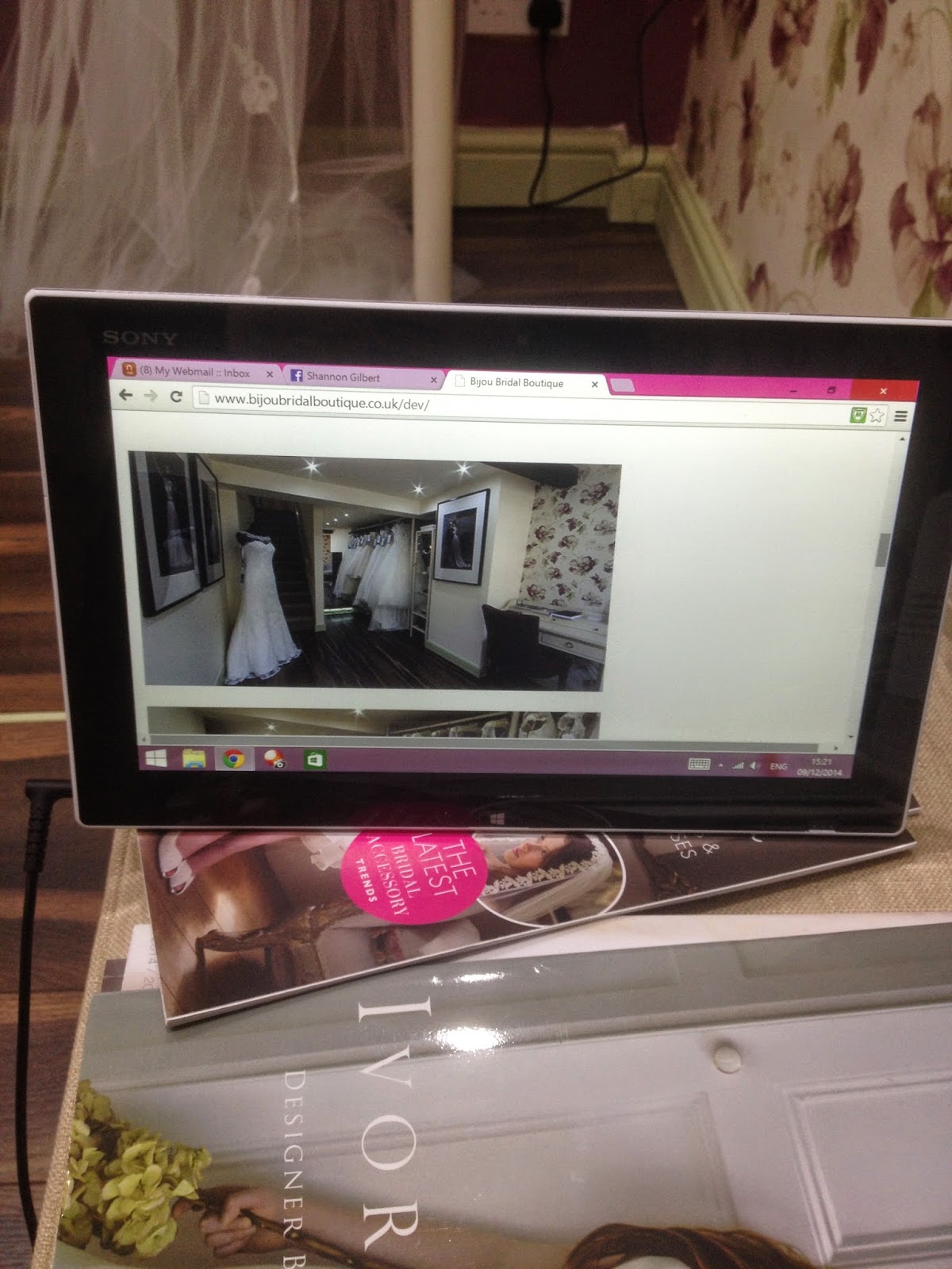
For this live brief, the guinea-pig was my Mum and her new bridal boutique that had just opened in Holmfirth as she needed a website to promote the shop and develop an established reputation.

Since last year, I have become very close friends with a guy called Chrish Dunne. Chrish graduated in Graphic Design last year at Leeds Metropolitan and has been freelancing since then for clients such as Relentless Energy, Fox News, and more independent businesses in the local area. Chrish focused his practice predominantly on web work during his degree and has developed impressive skills in back-end development thanks to it. I spoke to Chrish about the project I was going to complete for my Mum and asked him if he'd be interested in developing it into a fully functioning responsive site from my design. He was happy to help and we negotiated a reduced rate in the promise of more work in the future for site updates and development as the business grows.

This was the moment that made this project very enjoyable, I was able to fully disregard the area of web-design that I was not yet at a professional level and out-source it to a friend of mine, leaving me with the part that I find most enjoyable and that I am best at.

I had several meetings with my Mum and as each went by I realised more and more how terribly frustrating it can be to work with family members or loved ones. I was doing all of the work completely unpaid as it was for direct family and it's the least that she deserves for everything my parents have done for me in my life, however because she wasn't having to pay for it, this lead to many issues along the way. These involved changing her mind every few days (or hours while I was working on it), agreeing to my recommendations on content and layout and then challenging it, but the worst of all was the time pressures due to her not understanding the extent of what I was doing for her.

This project developed a lot of patience in me while working at the same time as teaching me how to deal with difficult clients.

The design itself was very enjoyable to complete as it is a market and target audience I have not worked with before, this meant the research process was very interesting such as the styles and themes of well established bridal shops and websites and how the quality wasn't much to work above, yet the prices were extraordinarily high. This issued a lot of confidence in my abilities and that I would produce something effective, easily navigated and visually beautiful and it would be built to that standard too thanks to my friend Chrish.

The final website has been live since the beginning of December and has attracted many customers from all over the North of England to visit the boutique. Mum makes a point of asking people that come in how they found her so that she knows what advertising is the most effective and they almost always say through the website and how beautiful it is. This is always a great thing to hear, especially as my Mum likes to text me every time it happens, I am really happy that I was able to create a product of work that I am very proud of at the same time as helping a loved one kickstart her business in a market thriving in competition.

OUGD603 — Brief 02 - Bijou Bridal Boutique - Live

Very happy to say the website is now live. Check it out here.


OUGD603 — Brief 02 - Bijou Bridal Boutique - Website build

When it came to building the site, four days estimate quickly turned into 3 weeks of work trying to fix hack parts of javascript. The developer, my friend Chrish, ended up saying that because the aim of the site is to be responsive and viewable on all devices, the design I had created is doable but with a very expensive javascript developer, with his knowledge a few things needed to change to make it work. This didn't effect the usability at all, it just made the responsive design more adaptable.

A week of tests with issues from a variety of screen sizes kept arising. The client's 2 in 1 sony vaio was a nightmare to work with because of it's peculiar dimensions. This made Chrish's job even harder because as soon as everything had been fixed, more problems arose from the fixes on a different device.


After some trial and error, he got it all working spot on. Not exactly to the original design but this taught me a lot about web development. What is sane - and what isn't.


OUGD603 — Brief 05 - The Ministry Of Wonderful - Boards


Evaluation:

The Ministry of Wonderful brief was another visiting professional lead brief that I feel had the potential to be really enjoyable if I had more time and energy to push it to my usual standard.

Unfortunately this came about during a very busy time and I didn't have the time to develop it to a quality I was happy with.

I picked Retirement Home out of the hat to brand and was really excited to develop concepts to create something great out of such a bleak subject that upon researching i found quite a depressing reality in Britain.

This brief helped me practice researching and found the most effective to be discussing the subject with people. Jane Hansesgaard on the course is Danish and I asked her what the system is like over there and she explained that it is much more positive and designed to give everyone a really nice and enjoyable last few years of their lives as thanks for all they have done for society in their working lives. I found this to be amazing and still question why the UK do not have a similar outlook.

I pushed this into my concept and had to develop it very quickly before realising I had let myself down by not giving myself enough time on it and spending it on live briefs with approaching deadlines instead.

If I had more time or I didn't have as many jobs happening at once I would of loved to push this concept into something more effective, successful and well rounded as the challenge was well put together and an enjoyable experience.

OUGD603 — Brief 01 - Halleycat 2014 - Boards


Evaluation:

This brief was a direct result of my plan to push myself into this academic year of the programme head-first. I approached Nathan Hughes, Director at Restrap, and Tim Pulleyn, blogger of The Broken Line, but also both the event organisers for the annual Halleycat the week we got back from Summer and with October just round the corner, I knew I had approximately two to three weeks until I would have to of finished and began production on print.

I had not yet been to the event before as I had only just started getting into cycling when the last one took place but as an independent fixed-gear event, it is one of the biggest in the country which consists of a selection of competitions on bikes that earn you points, one with the most points wins a cash prize and lots of goods from the sponsors. I had already heard a lot about it but I spent time researching it by searching the internet for photographic, filmed or written documentation of the past events.

This was a very fast-paced, yet smooth and well planned brief that got me straight back into my working routine which did a lot for my preparation and development of later projects and the beginning of my critical writing.

This brief allowed me to work on a full spectrum live branding project that was related to my passion of cycling. It also worked as a really positive networking tool that brought me close to the independent cycling businesses of the area and gained the trust in my abilities and professional practice of Nathan and Tim which lead to a collection of other briefs specifically for Restrap.

Within this brief I was able to have a go at a completely new practice which was videography. I have always been very interested in photography and have practiced with a DSLR for years but video was never something I have attempted. My skills in photography helped me establish the grounds of shooting video and gave me the chance of learning, developing and enhancing both new and existing knowledge in image capturing as well as software skills in Adobe Premiere.

I am very happy and proud of everything I designed, made and executed for the Halleycat brief and it has become a featured project that professionals like to discuss with me along with the brief starting some very positive friendships and business relationships with the cycling community in Leeds.

OUGD603 — Brief 07 - Restrap Packaging — Interim Boards


OUGD603 — Brief 03 - Dr.Me - Boards


Evaluation:

The DR ME brief was a really good break from the current studio happenings that I feel everyone present benefited from. This however was a drawback too that at the time felt frustrating to take time out of what I was already doing, this was because of a looming deadline I was working to and this brief felt like it got in the way of that.

I didn't let these feelings get in the way with the opportunity of working in a collaboration with Dan Everitt where we combined ideas, aesthetics and concepts to form a response each but with the other being present and engaged in the process of it, allowing feedback, idea development and playing with the outcomes.

Brief 01 was the 12" vinyl sleeve design where we took the opportunity to experiment with collaging as that was the dominant practice involved at DR ME and something neither of us have ever tried. We listened to the music and began throwing around words that felt fitting to the theme before going to the library and spending a while exploring books and scanning them in. I found this process very difficult as it wasn't something I was used to, and even though it was a good idea for both of us to try something new and different with some guidance from visiting professionals, I don't feel like it benefited my way of thinking or my practice in any way. I really struggled to work with bits of imagery cut out and brought together as I am so used to creating my own content that moulds itself to the given brief. In the end we decided to put forward Dan's response as it felt much more fitting to the music and evoked a scene and presence that unfortunately mine didn't.

For the second brief, I felt like I was more in my prime. I enjoy making posters, especially when it is music related because there is usually a very awkward amount of content that needs to fit in a legible format at the same time as jumping out and grabbing the target audience. Neither of us had heard of the band before so we gave them a listen and even though it was to neither of our tastes, we tried to show the music in the visuals. I enforced this with hand-rendered typography contrasting with a sans-serif typeface, bright colours and a manipulated photograph of the front-man's face. I was really happy with this outcome as it communicated their music very well in my opinion and was fun to play with type again.

There wasn't much time to complete the final brief so while I was already in a type-focused mind-set I decided to draw some motivational hand-rendered typography that read 'Develop Yourself' this was a relaxing way to finish the day and outlet some creative juices.

The day-brief as a whole was very useful in giving me the chance to play with a different way of thinking and doing but I found that neither worked very well for me. DR ME were very interesting to talk to and shone light on a lot of different ways of thinking in pressured situations which I will take away with me and remember in future scenarios where there isn't much time to effectively create a developed concept.

If I was given the chance, I don't think I would do it again or change anything I did, it was helpful in some ways but I didn't enjoy it in the moment much and didn't feel excited about the work I was doing for it.

OUGD603 — Brief 05 - The Ministry Of Wonderful - Brand Development

Speaking to Jane on our course really got me thinking about how much better their retirement system is to here. It is so bleak here and unless you are quite wealthy and can afford a luxury private retirement home. To develop a brand that focused on affordable retirement in a peaceful area with no expensive luxuries but a much more lively atmosphere was what I wanted to focus on.

Jane told me that Danish retirement homes are similar to small flats that have their own facilities. This is great for the more independent elderly that aren't quite at the chair/bed-bound stage in their life, once that time comes around (if ever) more care is implemented.

I also read that Denmark is in the top 10 places to retire in the world and has the highest life satisfaction rating in the world. — Source

They focus a lot on enjoying the last years of their lives and are very engaged with taking their residents out of the retirement home for activities and day trips. They are usually situated on the coast so there are beautiful views and they are almost always very quiet and peaceful.

The idea of the residents being on a prolonged holiday to take a break from the difficulties and burdens of working life was something I was quite interested in, and that is why I am calling my retirement home 'Lang Ferie Retirement' - which means Long Holiday in Danish.

In regards to the brand's visuals I wanted to capture their values as the front line. To make sure this happened in my project I created a very simple logo involving the danish flag and some characteristic sans-serif type.


This felt quite corporate by itself which would prove to be an interesting experiment in branding as the aimed aesthetic must appeal to people in search for a retirement home either for themselves or a loved one.

Brand statements would entice viewers with the lifestyle and brand values such as:

"Take a long holiday."
"Retirement - the Danish way."
"Feel more alive than ever."

I thought maybe pulling this together with photography would communicate these brand values and override the logo to become part of a welcoming & friendly identity. This paired with a strong colour foundation secures a consistent visual for the brand.


I will be interested to hear the feedback SM have for the direction I have gone in and the outcome of the brief.


Copyright 2010. All rights reserved.