We all had a go at developing the logo to reflect our concepts, and later, I was chosen to develop it further.
We all liked and felt like the original logo I designed was a strong look that represented the combination of cities and the upward rising of them all in unison. It felt corporate but not boring, and it made an impact.
I later had an idea to push this further towards the 'escapism' concept. Using a combination of an upwards mono fade and halftones, the logo itself would 'escape' upwards to symbolise the people's possibilities up here.

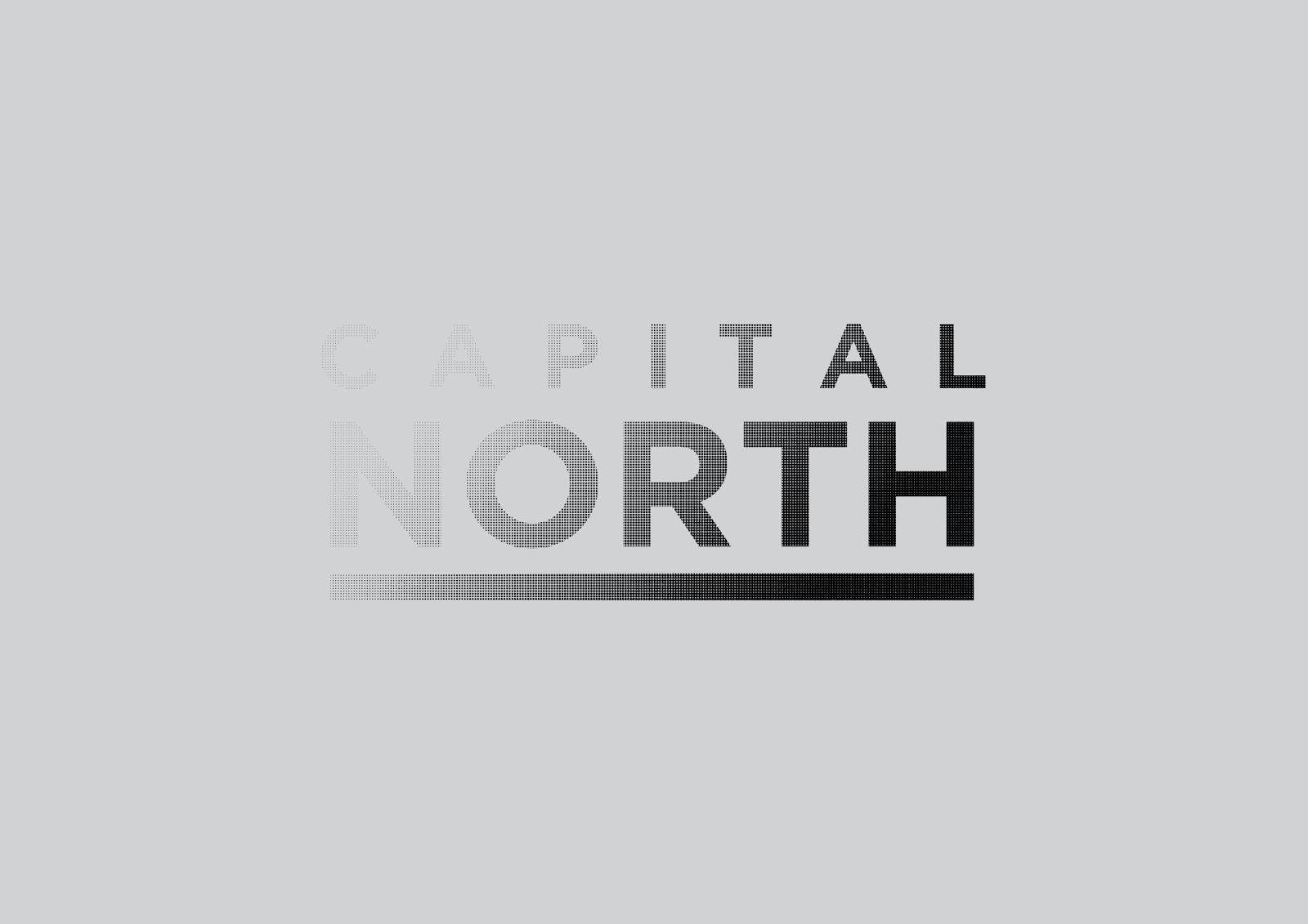
After a few goes, I managed to find a good balance of fade that didn't leave the logo illegible at any size.

Once this had been achieved, the idea was pushed to make that escapism concept even stronger by allowing the halftones to escape away from the logo's frame.

Upon receiving feedback, everyone was very happy with the final outcome and it was ready to be implemented among further works to show context and brand.
Leave your comment