This project consisted of an incredibly detailed referencing system in the index to allow users to easily access everything in the book quickly and efficiently. The talk itself had a big impact on us and stirred some inspiration with our yearbook.
Something we all agreed about the previous year-books is that they either lacked character or personality. We are a course full of completely different individuals that specialise in a vast spectrum of different practices within graphic design and to all look the same within a book would be both unfair and unrealistic as none of us can fit into the same box. We decided that a form of archiving system at the front of the book would work incredibly well to show everyone's prime skills at the same time as what they are interested in. This would allow potential employers to find the students that specialise in a particular practice that they are looking for in a potential junior.
Unapologetically, we got quite excited and began discussing aesthetics and finishing solutions. We all agreed that the book is a tool that works as a presentation format of each of us as individuals and that if we wasted page space on information, there would be less space to show what we could actually do.
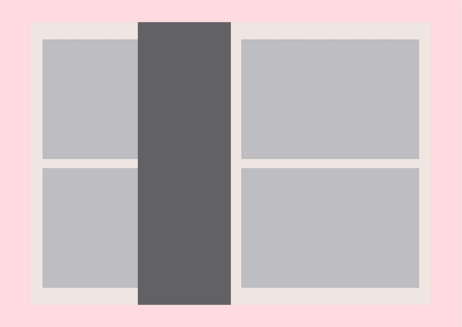
This is where the half pages idea spanned from. Each student could have their own double page spread that presented their work with minimal margins and as much content as we could fit without ruining aesthetics. Between this spread, a half page in a thinner stock choice could have all of the information needed about the individual (Name, contact details, bio, etc), this both adds personality and another dimension to the book without adding much to the total cost.
This is where the half pages idea spanned from. Each student could have their own double page spread that presented their work with minimal margins and as much content as we could fit without ruining aesthetics. Between this spread, a half page in a thinner stock choice could have all of the information needed about the individual (Name, contact details, bio, etc), this both adds personality and another dimension to the book without adding much to the total cost.
We discussed the idea of photos of each student in the year book. The reason for this was to add more personality to the book at the same time as working as a visual reference for those who pick the book up. Before, you could absolutely love one of the students work presented at the show and want to talk to them about it, but not have a clue as to what they looked like so were unable to network in person. This would resolve that issue and open up more initial opportunities for us as students.
We still felt that there lacked a personality to the book and it could be warmed up a bit more with our own reflections. We had an idea of designing a list of questions that could relate to our personal time at university, for example:
Staple food?
Time stayed up working before a deadline?
Number of blog posts?
Amount of lino-cutting finger injuries?
...etc
This would provide a perspective into our student lives while at Leeds College of Art and how we have shaped as humans as well as professionals.
In regards to the design elements themselves, we felt that rather than overcomplicating the book and turning it into an attention grabbing piece of work itself, that it needed to celebrate the work inside it and work as a platform tool to present it. Taking a more tactile approach to encourage people to both pick it up and then keep going through it all, we decided that a cheap but effective way to do this would be to use greyboard as a cover stock and quarter bind it with either a litho or foiled front.
From here we constructed our pitch presentation and hoped that our concept was clear enough and it made enough sense to be developed further as the Leeds College of Art Graphic Design Yearbook.


Leave your comment