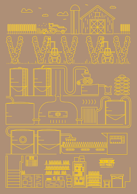
Now I had the full illustration completely finished, I needed to play with colour options. I had a rough idea of what I thought would work best which was a pale yellow and brown to represent the beery colours you tend to relate to the craft, but I wanted to experiment just in case.
I decided finally on the light cream and burnt brown colour-way as I felt it would work in an exhibition environment the best at the same time as linking back to it's beer-y roots.


Leave your comment